
Cohesion through Colour.
A touch of purple.
“My perfect cousin delivered outstanding results for our project. The team understood the brand vision and executed it flawlessly, capturing high-quality images that perfectly represented products and services.
Their professionalism, attention to detail, and ability to meet tight deadlines made the entire process smooth and efficient. Highly recommend for any need of top-tier commercial photography!”
Henry Zhang
Managing Director, Ever Culture
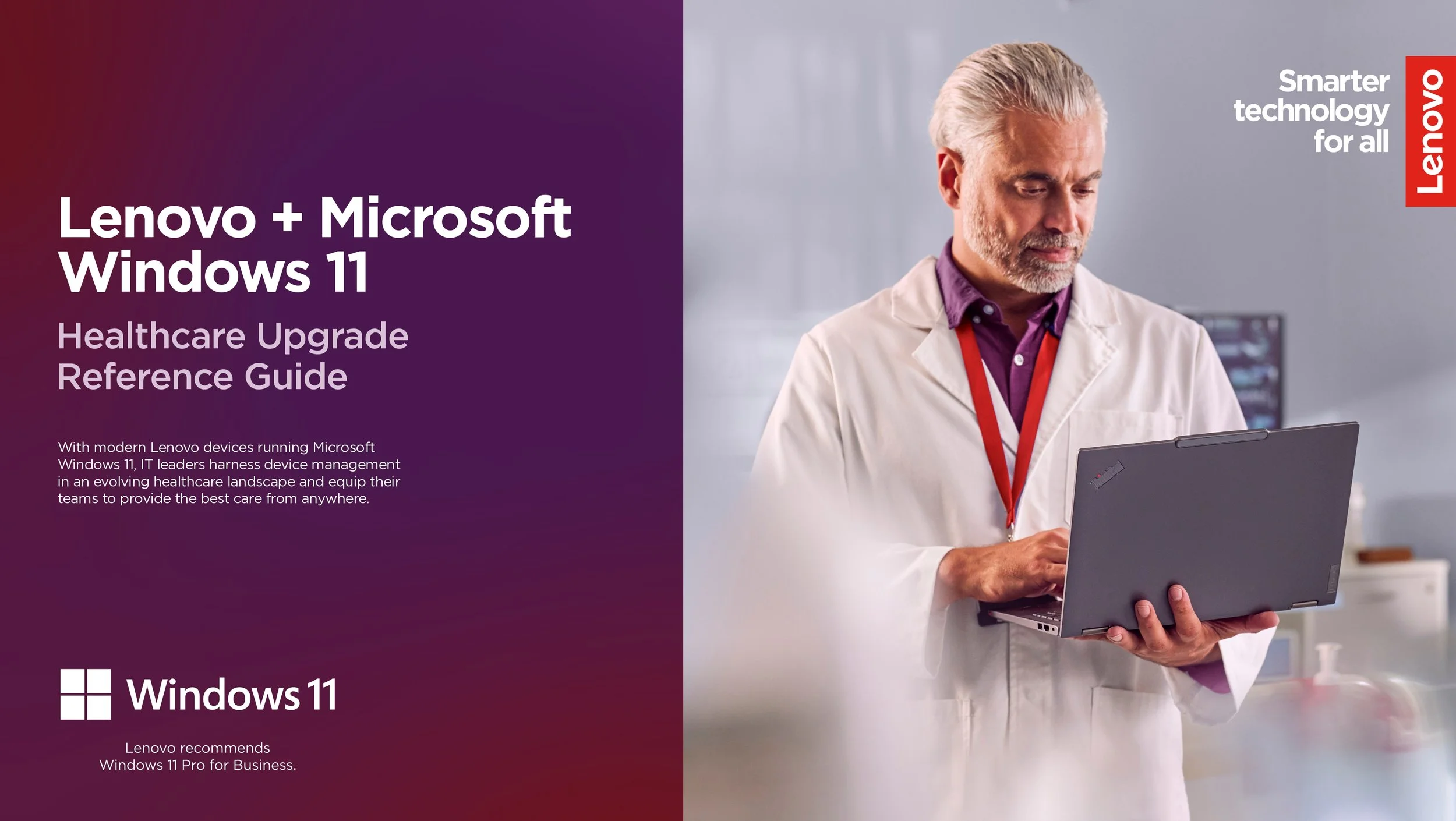
In a sector that demands clarity, credibility and compassion, Lenovo needed a photography brand library that could speak to global healthcare audiences with cohesion and confidence.
We created a unified visual identity, centred on connection, calmness, and a single defining hue.
The Brief.
Healthcare is a complex, competitive space and for global tech leaders like Lenovo, breaking through takes more than innovation. It takes trust.
To strengthen their offering of their healthcare technologies worldwide, the team needed a brand photography that could represent their advanced offering in a way that felt human, warm and accessible. The imagery had to resonate across a wide range of international markets, reflecting cultural nuance and sensitivity without losing visual coherence.
Internally, they wanted to raise the bar on content quality and visual consistency across marketing, sales and brand communications — giving teams the tools to speak with one voice. And crucially, the library needed to replace generic stock imagery with something ownable, credible and deeply aligned with the values of the brand.
The photography had to bridge a lot, tech and humanity, precision and empathy, brand and product. We were tasked with delivering a visual toolkit that made all of that feel simple, seamless and recognisably Lenovo.


Selection of final images.
The Solution.
In partnership with Ever Culture , our team approached the project with a single guiding principle. Build trust through human-centred storytelling.
That started with casting. We selected a truly global range of faces. real, relatable people who reflected the diversity of healthcare professionals and patients around the world. No tokenism, no glossy perfection, just credible human presence.
It was critical to find the right clinical and medical setting, somewhere that looked and felt authentic, while also giving us the flexibility to work at pace. By keeping all shooting locations in a single, controlled environment, we were able to move efficiently across multiple setups and unlock a high yield of high-quality, brand-consistent images in just two days.
Visually, we developed a system that could flex across multiple markets and content needs while staying consistent and recognisably Lenovo. From lighting to wardrobe to prop styling, every detail was considered for repeatability, regional adaptability, and long-term brand utility.
One element brought it all together, colour, a touch of purple, and a subtle hint of red. Lenovo’s core brand colours were quietly woven through the imagery, in clothing, accessories, furnishings and even light temperature, creating visual unity without ever feeling overt or forced.
“Colour unifies this set of imagery in a subtle yet strong way. This is the result of pre-planning and control at point of capture using lighting and styling.
In post production we fine tune the colours to get a precise alignment with the brand palette, unifying the visual content.”
Adrian Weinbrecht
Director of Photography & Co-Founder, My Perfect Cousin
What we created wasn’t just a one-off shoot, it was a practical, repeatable visual language that teams could use with clarity and confidence, wherever they were in the world.
The Results.
In just two days, we delivered 56 unique and usable assets — a strong return for Lenovo and a clear reflection of how we balance quality with efficiency. This high yield wasn’t just a production win, it was a creative one, designed to give Lenovo a visual toolkit that would go further, last longer and adapt across regions and channels.
By replacing stock with brand-authentic photography, Lenovo could speak with more credibility and emotional clarity. The new imagery helped bridge the gap between advanced healthcare technology and the real human experiences it supports, helping the brand show up with empathy and purpose.
Internally, the teams gained more than new content, they gained a shared visual language. A consistent look, a recognisable tone and a clear sense of brand identity. The photography helped Lenovo’s global teams move faster, brief better and deliver stronger work with less friction.
“This project wasn’t just about capturing images, it was about creating a visual story Lenovo could own and build on.
Our goal, aligned with Henry’s vision, was to make content that’s practical, a toolkit that makes telling their story easier, clearer and more impactful, wherever and however they need it.”
Alex Watson
Creative Producer & Co-Founder, My Perfect Cousin
Looking to build your own content library? Get in touch or if you’re interested in finding out more about building brand libraries then go have a look at On Time, on brand, right on .


Implementation of brand images across Lenovo web, sales and marketing assets.